
Tuesday 31 January 2012
KM - Magazine Advert Draft
Here is our first draft of the magazine advert, after discussing it through as a group, I will then make any changes that we feel are needed. (Click the image for full size)
KM - Green Day magazine advert (Kerrang!)
 |
| Green Day Magazine Advert |
- Screenshot from the video for the single
- Information about the album and single
- Release dates
- Image of album cover
- Use of red and white font
- Band name in large white font
- Information about the included DVD
- Record company logo
- Official website information
This magazine advert is split in two, with the main focus of the top half being an image from the performance section of the video for "Wake Me Up When September Ends", and the band/ song name. The bottom half of the ad features all the information about what is included with the album/single. It's structured in this way so that the viewers attention is caught by the large image and this encourages them to read the details in the bottom half of the advert.
KM - 30 Seconds To Mars Magazine Ad (Kerrang!)
Things included:

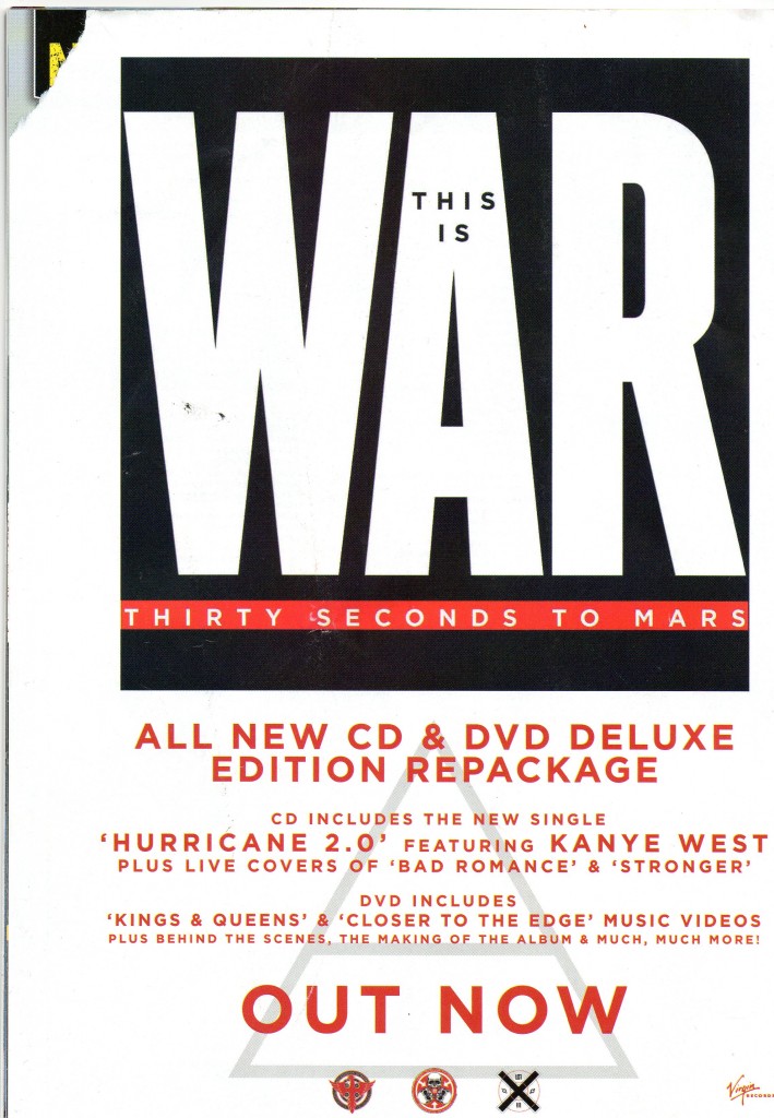
- Band Logo in the background of the advert
- Mentions of the singles/ other artists featured (Kanye West)
- Artwork of the album title/ band name
- Fairly plain white background
- Red coloured text
- Simple Serif font
- Record company logo
- "OUT NOW" in large writing
- Mention of the bonus DVD/ features
I plan on using a lot of the features of this digipak in our group's Nine Inch Nails digipak, such as; the band logo, the record company logo and details such as what singles are included and the bonus DVD. Something that doesn't feature in this magazine advert, but does often appear in others (and something we plan on including) is a number of tour dates on the advert.
KM - Examples of magazine adverts (Q)
 These Adverts all came from Q magazine, although they are all adverts for tours, the bands and song writers are aiming at the same target audience and techniques to capture the target audiences are going to be used. Q is a magazine that could include Nine Inch Nails, as they often feature a large variety of Rock/ Metal bands.
This is an advert for the band Noah And The whale. I instantly notice that the writing is black while the background is white, highlighting the contrast between the two which makes the writing stand out more and become more eye catching. The photograph itself is an artistic old fashioned photograph of the band looking deep and thoughtful, the photograph film is the same colour film that they used in the the 1960s, this is the time where great legendary bands such as the Rolling Stones and the Beatles were introduced so the film type has been used to reflect on these legendary bands and imply that this band is also this great. There are tabs of red on the poster which your eye is very quickly drawn to.

This advertisement is much more basic and less eye catching apart from the giant Funeral Party sign. A lot of this advertisement is devoted to the name of the band, this is because when a fan of this band is looking through the magazine the band want to do everything in their power to grab the fans attention and to let him know about the bands activity. I really like this style, its simple and eye catching and does not overwhelm the viewer.
Like the rest of the band advertisements, this Villagers ad features large font for the name of the band and contrasti
 ng colours laid on top of each other to catch the readers attention, this contrast of colours is something we plan to use in our NIN magazine advert, using black and white. The picture in the background is the logo of the band so if the fan does not get drawn to the giant “Villagers” letters they will get drawn to the logo. This can be very useful tip when creating our advertisement, if I make the screenshot from our video that we plan to use in the ad large as well as having large lettering for the Nine Inch Nails logo then at least one of them will be eye catching and draw in a viewer. The picture also has to be interesting to draw in the members of the public who are not already fans, like this one.
Sunday 29 January 2012
Wednesday 25 January 2012
HK: Digipak Research AC/DC

It is good to look at more genre specific examples to see if there is any codes and conventions that the follow.
The front cover is quite simple, no photo but just a brown/grey textured back ground no real use of colour.
It is clear who the album is by and that the artist is AC/DC as it has the band logo taking most of the focus in a large font at the top of the cover.
Below this in a smaller, darker font written all in capitals is the album name 'BACK IN BLACK'
It isn't a very glamorous or glossy cover at all, no use of colours or bright images that are usually on digipaks to attract people to the CD and make it eye catching in shops.
There is a very large sticker which takes up almost a quarter of the front cover, this says information about what is inside the digipak like what singles it includes and how it has been digitally remastered.
The Inside

The inside of the digipak on the inner let panel has photo's of all four band members with the names of them in the photo's these photos have been shot or edited into a colour effect that fits the colour theme of the digipak.
On the right panel is the CD which is similar to the front cover and has the same sort of texture effect on it.
The Back
Is pretty much the same as the back, it has the same brown texture, no colour or images.
On the back is the list of tracks in the album.
Below this is copyright information, information and credits about who digitally remastered the CD.
 The adress for AC/DC's website. There are two logos of the record company and the production company.
A scannable bar code is located in the top right for sales purposes.
Wednesday 18 January 2012
KM - David Fincher (Director)
 |
| David Fincher |
HK - DigipakEG 3: Bryan Adams
 The third digipak i looked at was by Bryan Adams, this was a quite obscure one.
The cover photo is a piece of metal that has the album name stamped into it, the text doesn't line up and is pretty sketchy giving a cross a more thrashy/low budget look to the album.
Other than this the only other thing on the cover is the name of the artist in a black font that stands out against the silver background image.
The spine is simple with just serial number, album and artist name. In a simple black font.
The back of the digipak has an background image that is a picture of a hand with a ring on and on the ring says '18 Till I Die' so it now becomes apparrent what the image on the front cover was.
There is a close upphoto of Bryan Adams slap bang in the middle of the back cover and above this has information on where the tracks on the cd were recorded with the 18 Till I Die always in a larger font.
There is of course a bar code this is placed in the top right which is different to most as they are usually located in a bottom corner.
There are production company logo's and also copyright information about the CD.
HK - DigipakEG2: Jack Johnson
 The second Digipak I looked at was Jack Johnsons's: In Between Dreams album.
The album has a simplistic yet striking feel to it the black and yellow theme makes it stand out.
In the top right hand corner we have the artist and album name the artist name in a black san serif font that stands out against the yellow background making it very easy to identify which artist the album is from.
The tree looks like a real life tree that has been has been edited to have a sort of cartoon style effect.
Below the centre image of the tree in the bottom left of the cover is a SPECIAL EDITION sticker in silver, the sticker is actually a reflective material which would catch your eye if you saw it in a store.
There is another thing in the top right that looks like a sticker but is actually printed on giving information about what tracks are in the albumn.
The Spine is very simple with just the yellow logo and a tiny bit of the image of the tree still on. The album and artist name a serial number and a very small record label logo at the bottom.
The back is very very simple pretty much just a plain yellow cover but with a graphic of a tree trunk.
It has song info on the back but not the times of the songs which often appears in some digipaks.
as standard there is a barcode on the back.
Two production company logos are shown on the back and also there a three websites.
Production company website, Jack Johnsons Website and a website for a charity organisation.
HK - DigipakEG1: Ignacio Fernandez
I have been doing some research into digipaks recently as it a task for our coursework to create a digipak for our track.
 The first digipak I looked at was of Ignacio Fernandez.
It had a very simplistic cover photo just a medium long shot photograph of the artist with his guitar leant against a plain orange wall.
It doesn't follow normal conventions of digipaks which usually have more than just an image they usually have stickers or more text on the front such as album or artist name, sometimes have parental guidance warnings or other logos.
The Spine is still quite simplistic with just a white background no effects just the white background and the text that says the artist name in red and the album name in a light orangey yellow.
REAR PANEL (EXTERNAL) The back of the digipak has more on it, but is still pretty basic, just a creamy white plain background but with a lot of text again we have the artist and album name in red and yellow but these at the top in a larger font stand out more than the rest of the text below that is in smaller writing except from the track names that are in a bold red font as appose to the smaller black font that gives some description about the album written in spanish above.
Below the track list is credits with the names of people who play what instrument, the instrument written in a small font whilst the names of the musicians is in a black bold font to make the names stand out.
At the bottom below the credits are some of the company and production LOGOs we have the logo for CM records in the bottom centre with a brief bit of copyright information.
To the left of this is the technical producers the people who made the cd with the enhanced CD logo.
and below this is the web adress to Ignacio Fernadez's official website.
In the bottom right is a bar code which is usually on every digipak as it is required for when selling them in shops.
KM - Research into magazine advertisements
 |
| Example of magazine advert |

Thursday 12 January 2012
BH- Mark Romanek
Mark Romanek has worked with Nine Inch Nails on two music videos, such as Closer & The Perfect Drug, both of which where high budget videos and Closer was one of the more prolific videos for Nine Inch Nails courting a fair amount of controversy because of the nudity and the depictions of a monkey on the cross (obviously relating to the religious connotations).
Reznor was also asked to score his film The One Hour Photo however the studio (Fox) believed Reznor to be the wrong choice and subsequently decided that he was the wrong cho canned his soundtrack for the film.
He also directed the music video to Jonny Cash's music video to his cover of NiN-Hurt, so obviously he has a fair amount of history with the band.
His music video for A Perfect Drug was very gothic with a blue tint to make it feel much darker visually colder too. The gothic one is something shared with the Closer video, both of which featuring abstract visuals, with Closers style helped via the 20's Film reel used for filming the video, giving it a more sepia feel.
Tuesday 10 January 2012
KM - Performance filming

This weekend we will be filming our performance scene in Ilkley, we are thinking about filming up near the cow and calf, using basic equipment (2 guitars, amps, microphone and basic drum-kit) to contrast with the technology based narrative of the video. We have several people in mind, however nothing is final and we're still discussing this.
Thursday 5 January 2012
KM - Digipaks

Subscribe to:
Posts (Atom)